Project: iBotModz & Logos
Way back in 2006, I created a forum. It was hosted on Forumer and I used a free co.nr domain in order to not force folks to use ibotmodz.3.forumer.com and instead ibotmodz.co.nr. One thing that continually intrigued me was creating a logo for the website.
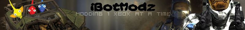
In January of 2006, the site launched with the below logo that merged an appreciation for Pikmin and Halo/Xbox together.
A laughable logo today, but a good laugh to look back at time. This logo saw a change when Halo 3 became more a focal point and it was time to re-brand ever so slightly.
Font changes that made no sense, more Pikmin tossed together in a warthog and cutouts of Spartan's just thrown into the background. This logo was used until it was time for iBotModz to expand. It was leaving the forum host behind for a VPS and an installation of e107 attempting to produce a site more than just a forum. This move was also changing the tagline from "Modding 1 Xbox at a time" to "now, just more."
So it was time to put up a vote for which logo would reign supreme.

Taking a look at these logos with their transparent properties now on this blog a decade plus later just shows how poorly made these were. These logos were horrible, they destroyed everything that felt underground in a pale attempt to up the professionalism.
The community was upset and did not like any of them. They wanted the Pikmin back and as well as the old site. So it was back to the drawing board with a far less tall image that could fit well in the site's theme.


These logos all attempted to use some form of the template, so the common black background would work for the theme. These logos also got attacked beyond belief and for good reason. The text/font for nearly every single one was just horrendous. The cry for help to include the Pikmin went overboard. Some poor render cutouts and attempting to blend a Pikmin in a design that just didn't feel as good as the original.
So this time, instead of building a logo based on the theme. It was time to try many different themes to refresh the site look and feel.


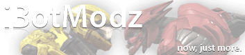
So now we had nothing interesting in terms of Pikmin or Halo, but a text driven approach that blended with each theme in question. At this point, the site needed focus in areas other than a logo so I had a change of thinking. As I became obsessed with renders and graying them in a specific color, I wanted to make a logo that showed off games I enjoyed.
The logo above is what I launched the site with. The community wasn't too angered with this one, because it just "worked" on whatever theme we were running. This appeared to be the logo that the community would allow till our next iteration.
So now it time to present random options throughout the forums of some attempts at a new logo design.
The cutout nature of the previous lead to a new iteration that focused purely on Halo, but not any good feedback came this way. So this logo was also tossed aside.
The next logo is what happens when you spend too long thinking that all the effects you can do in GIMP make a good image. This was also trying to hone in on that Web 2.0 feel with rounded corners. All in all, this was mocked and laughed at and abandoned.
So it was time to get back to roots. Halo.
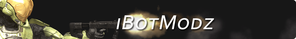
This was another attempt at rounded corners on one side, but flush to the boundaries on the left. This would sit on the top left corner of the website and was a good creative attempt to show off a new design. However, once again the community hated it claiming the text was not blended at all and it was missing a Pikmin.
So it was time to throw out everything attempted and head back to the roots. The old logo was returned, cleaned up and swapped for the new slogan.
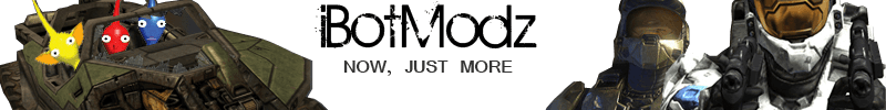
Folks loved it. They still wanted to critique the text, but the Pikmin and Spartan's were back so it naturally was loved. We had gone full circle after a few years and returned back to the logo that was the home of the original 2006 site with a new tagline.
Days became months and months became years and the site had slowly died off. Modding had moved to other mediums and hundreds of niche forums were falling aside. Real time chat groups reigned supreme, the era of forums were over.
So one last forum software upgrade was done, a new theme installed with the learned knowledge and a generic boring logo installed.
iBotModz then went to sleep and never changed logo's again.