Hello Ghost v4

When I saw Ghost v4 released I knew there was a few features I was excited for and a few that I was not - so lets jump into it. Ghost has been taking on the mantle of becoming the focal point for independent publishing and we saw that with the members module that launched in v3.
This once toggled member feature is just a core feature now. This for someone like myself with a personal blog was a pretty big shock since I don't intend to ever charge for my little hobby blog. This means that despite myself keeping these features intentionally disabled in v3 - they are now enabled in v4 with no option to turn off.

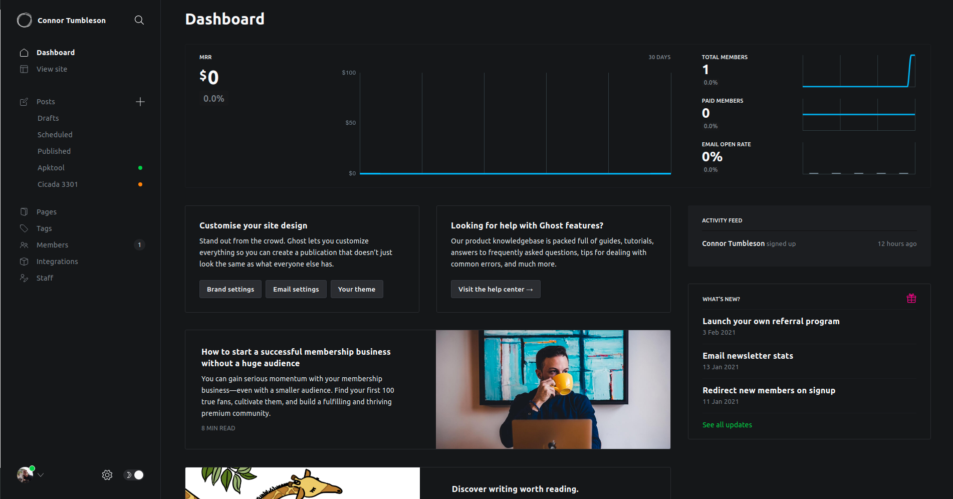
So above you see my dashboard now when I sign in. I get to look at a money making graph that will always say $0. I have to look at email/members that will also remain near zero until I decide to offer a subscription (which by the time this post goes live - may already be here).
There are marketing widgets given to me describing how to help my membership despite not using it. So I'm not too excited about this, but I pay $0 for Ghost and only myself sees this - so I can't be too angry. I'm no longer a target audience for Ghost and that is fine.
My theme which used to have if statements around member components now had login/register/subscribe buttons littered throughout. Thankfully, I could open those Handlebar files and remove that logic. While once again not happy that I was forced to edit my own theme to remove logic that a previous toggle setting once did - I will survive.
There are a few other places this feature permeated as well that I will just have to ignore:
- Post blocks for paid/free members only while writing a post
- Publish menu asking which type of members should receive it
- A forced
portal.min.js(source) that loads on pages for a feature I disabled
Now one thing that is currently fresh in my mind with this upgrade is the speed hit I took after the upgrade. I've been busy grabbing profiles to help isolate this stuff instead of just complaining with no proof, but this release so far isn't my favorite. As of writing this post, the speed issue was confirmed and triaged to be fixed in the next release so never mind on that.
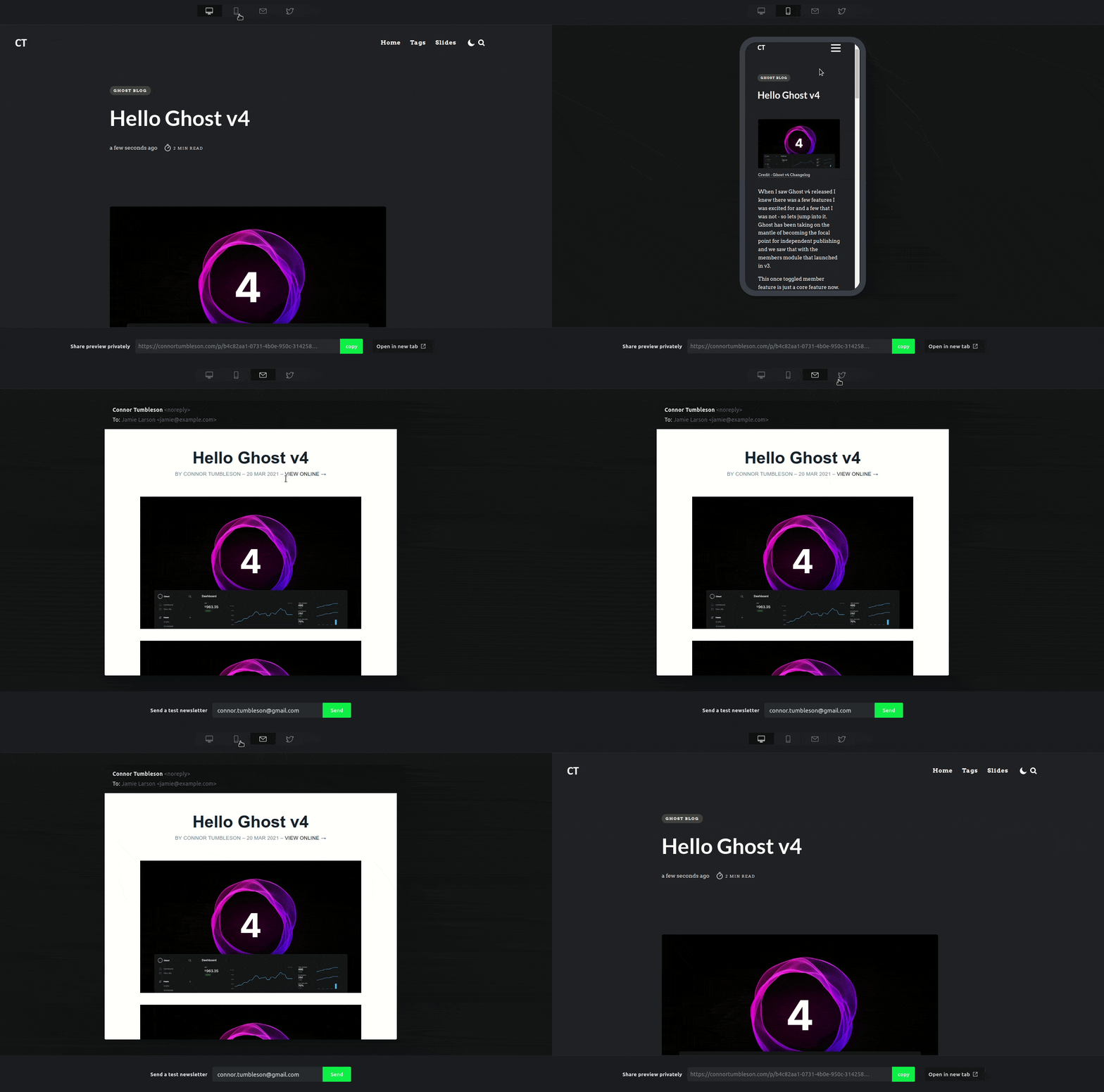
Though, I don't want to rant about this release for this entire post - there are a couple of features in this major milestone that I'm very much of a fan of. So first up is the new preview mode.

So this preview screen allows you to:
- Preview the page (Mobile and Desktop)
- Preview the social impact (Twitter, Facebook)
- Preview the email (if post is to be emailed)
- Send the email itself to test
- Share a unique URL to the draft
This is pretty nifty and helpful for making sure a post is good to go before scheduling it or publishing to the world. The tab for previewing the social snippets has a slightly strange UI, that I'm sure is a bug - otherwise this feature is amazing.
Next up is probably my favorite enhancement of this release is responsive lazy-loaded images. If we look back at last week's post - Halo Depot we can take a snippet of 1 of the images.
<img src="https://connortumbleson.com/content/images/2021/03/assembly-patches.png" class="kg-image lightense-target" alt="" loading="lazy" width="1413" height="884" srcset="https://connortumbleson.com/content/images/size/w600/2021/03/assembly-patches.png 600w, https://connortumbleson.com/content/images/size/w1000/2021/03/assembly-patches.png 1000w, https://connortumbleson.com/content/images/2021/03/assembly-patches.png 1413w" sizes="(min-width: 720px) 720px">What is important to see here is both the srcset and loading="lazy" changes.

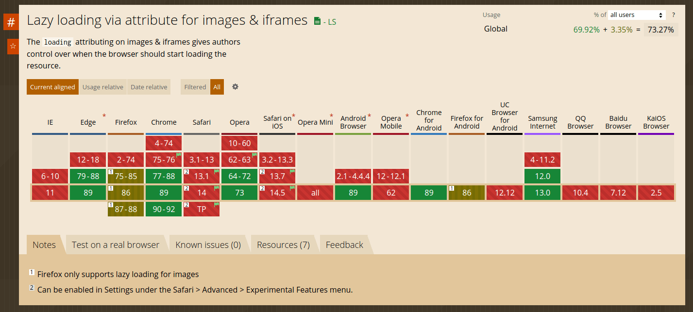
The lazy attribute is relative new, with support only really hitting Firefox and Chrome. This attribute helps instruct the browser to only load images as you get closer to them in the page. So if you were to view my Panda Love post with nearly 60 images - assuming you have a supported browser you'll only download the images as you get close to them.
This feature is futuristic and being supported in more and more ways every month. For Ghost to adapt this change quickly is part of the reason I'm always eager to take the next release.
The other snippet of HTML above includes a lot of srcset attributes which are basically a set of sources (images) that have hints for which browser should use that image. So a large monitor can grab a large image with maybe higher quality, while the mobile device can grab a smaller image. This is great because it just leads to a faster more optimized load, which can led to better SEO.
Now this doesn't mean I have to carefully upload different versions of an image every time I want to post one. Ghost is smart enough to take the original I upload and optimize, resize and cut based on internal parameters or based on logic that my theme requests.
With that - this blog is now upgraded to v4 and the full change log of features is linked. Next up, I'm eyeing a 1.7 upgrade for my comment system.
