Then and Now

In today's online world its a tad bit difficult to read a comment thread without the word "boomer" being thrown around as an insult. This is a classic slang term to refer to the Baby Boomer generation of folks that might be out of touch with some current thing.
I want to research salaries, wages, tuition and home prices and see if there is any merit to the constant debates online.
Tuition
Lets start with tuition and dig into the cost over time, we will use the NCES (National Center for Education Statistics) for these analytics. We can find a table that plots tuition + room/board from 1963 to 2020 which is a great range for us to work from.
If we look in 1963 a 4 year college average with included room & board + fees will cost you $1,286 or roughly $321.5/yearly to attend. If we want to take this same value in 2020 we have to decide between public or private schools - so lets do both.
An average private 4 year college average in 2020 with included room & board + fees will cost you $45,932 or roughly $11,483/yearly to attend. A public 4 year college however will cost you $21,035 or roughly $5,258/yearly to attend.
This looks quite alarming with the rise of cost, but before we go crazy. Lets take the 1963 value and apply inflation to it which changes that value to $4,348 for 4 years. Which kinda aligns with the present time of public university offset by about a thousand dollars. Sot lets show a graph to picture these 3 different values over time to see what we notice.
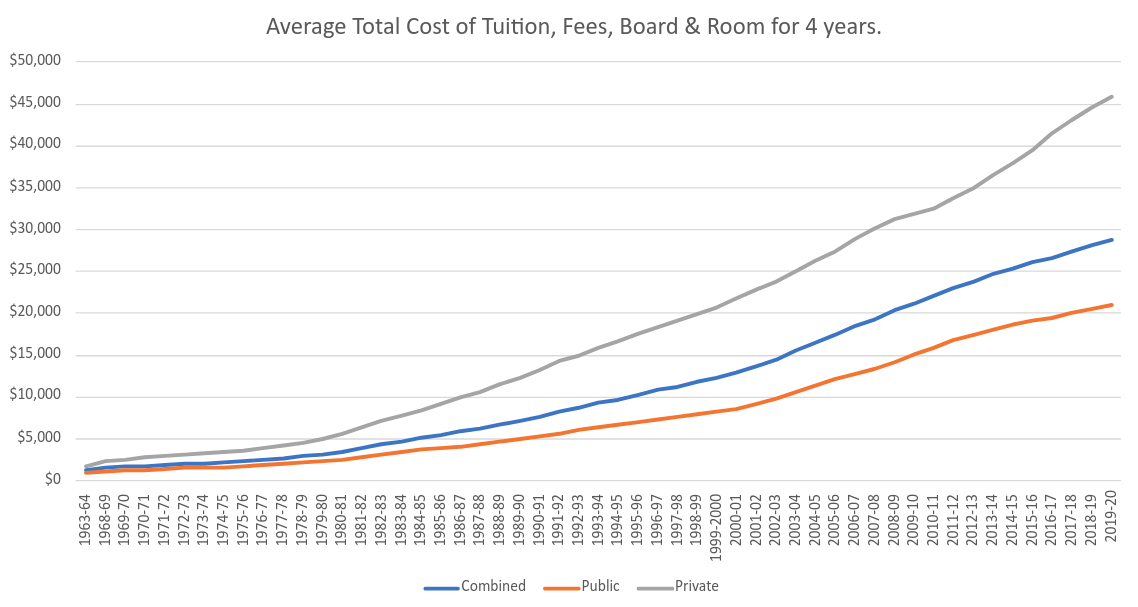
This just helps show that costs are going up quite heavily. A bit unbelievable even accounting for inflation that folks attended college for sub $2,000 total in 1963, though how did the education compare? I think we should apply an average wage over this same time frame and see if we can see any odd differences.
We will do two forms of comparison here, a purely federal minimum wage investigation as well as just a regular average of households income to better reflect a family wage set.
Salaries & Wages
Starting with a federal minimum wage lets plot an assumed 40 hours a week for 52 weeks a year salary.
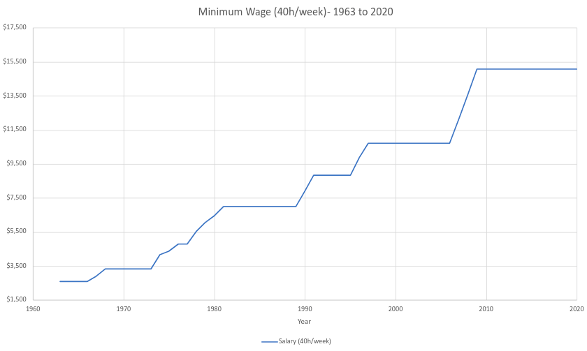
We know that way back in 1963, minimum wage was $1.25/hour - now in 2020 that is $7.25/hour which respectively comes out to $2,600/yearly (1963) or $15,080/yearly (2020). It seems minimum wage doesn't move often and when it does normally a few other rises follow quickly.
I think looking at McDonald's and seeing the price of a burger between 1963 and 2020 would be a cool comparison - we can see how many burgers you can purchase with an hour of work.
So now lets do the math assuming nothing else but the price of the burger:
- 1963 - $1.25 (1 hour of work) / $0.15 = 8 burgers + 5c change
- 2020 - $7.25 (1 hour work) / $1.59 = 4 burgers + 89c change
So effectively an hour of minimum wage work in 1963 vs 2020 will net you half the regular hamburgers it did in 1963. Is this an indication that food prices should be lower or that minimum wage did not follow the rise of pricing? We haven't even opened up the debate about much the staff should be paid.
So lets pivot away from minimum wage and find some analytics from the U.S Census Bureau for income of households. I think this comparison between minimum wage and food would be interesting to play out except over household income vs tuition for 1 child.
The survey results were grouped into 6 groups - fifths from lowest to highest, then a special top 5 percent group. So if we looked at 2020 mean income for all households we get:
- Lowest Fifth - $14,589
- Second Fifth - $39,479
- Middle Fifth - $67,846
- Fourth Fifth - $109,732
- Highest Fifth - $253,484
- Top 5% - $446,030
So yes, the lowest mean fifth looks a little like what minimum wage would obtain. So now, lets plot this since 1967 and see if we see these fifths change over time. Afterwards, we will add in the cost of tuition to see the correlation.
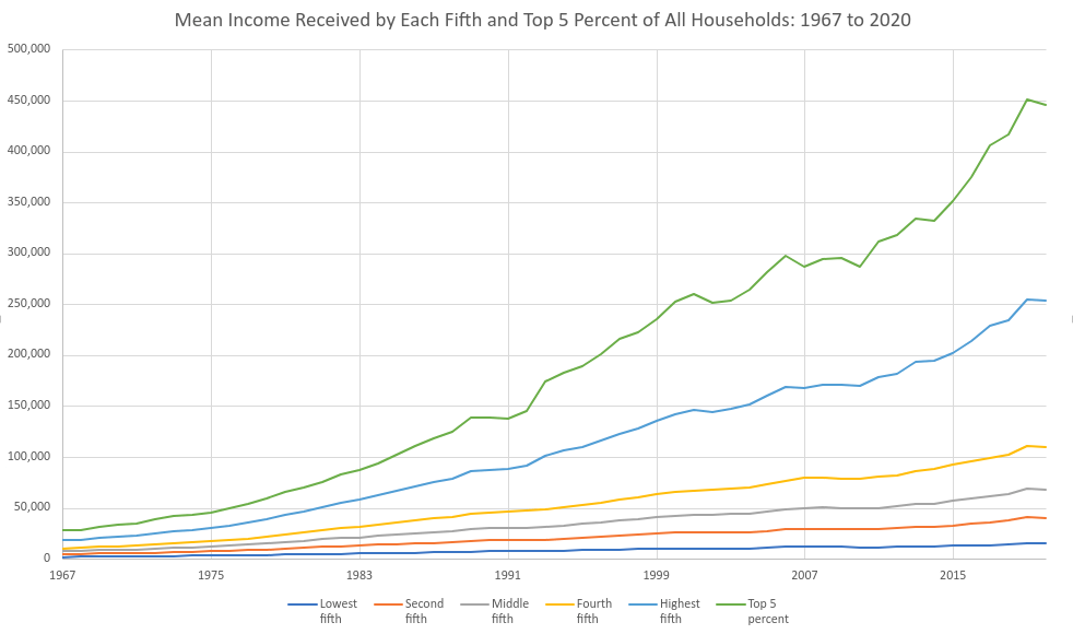
I'm no statistician, but I do enjoy tabulating some analytics into some cool charts. This one above shows that unforunately the lowest fifth even accounting for ~50 years of changes - still only makes minimum wage. Though we can see a larger separation from each fifth as time goes on especially in the realm of the 5% and highest fifth.
So now, we know from above of tuition pay ranging from 4 year public & private universities. So lets drop our scale from $0 - $50k and add in those 3 tuition calculations.
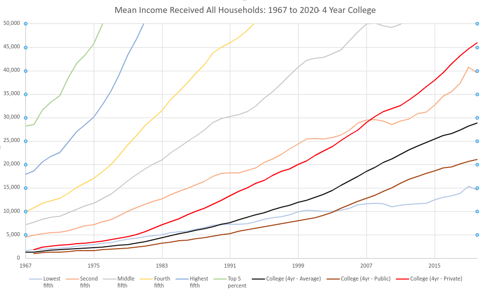
So the lighter lines are from the previous image, this time the scale on the vertical axis caps out at $50,000. So we can see some interesting points here:
- You could attend public university at minimum wage until ~2003
- Around 2007 not even the second fifth of income could afford any university
- The top 5% skew results
It just seems a bit odd to me that college tuition is rising at quite an insane pace. Students graduate with a ton of debt to work off with salaries that obtain half the McDonald's burgers they got in 1963.
So I think finally a good graph to do would be to find the average home sold from 1963 to 2020.
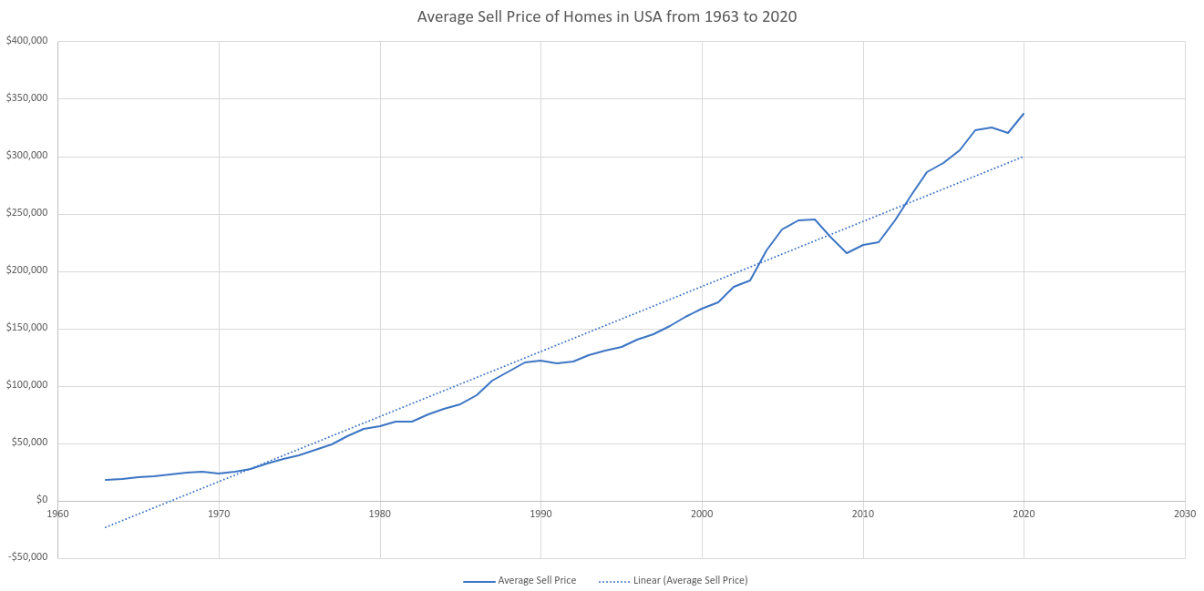
The graph above shows just that, with the following important dates to note:
- 1963 - $18,050 (Starting)
- 1987 - $104,700 (100k)
- 2000 - $167,550 (Y2K)
- 2004 - $218,150 (200k)
- 2016 - $305,125 (300k)
- *Q3 2021 - $404,700 (400k)
This graph when also applied with a trend line produces some interesting results that in order for the line to be properly applied to the data set the starting point has to be negative. I don't think they were giving away homes in the 1960s, so here we are with home prices rising pretty heavily over the trend in the past few years.
Not to mention think about how many years it takes to go up another 100k.
- $0 - $100k roughly 24 years
- $100k - $200k - roughly 17 years
- $200k - $300k - roughly 12 years
- $300k - $400k - roughly 5 years
If this trend continues are we expected to see the average home cost to be half a million dollars in 2025? I think we should apply our average income per household to this chart to see how things align over time.
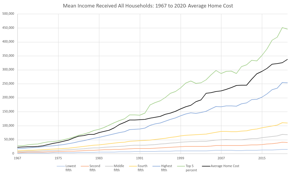
This graph I think shows that home prices in the early few years were quite close, it still would take minimum wage a solid amount of years, but it wasn't insurmountable. I'm sure you've heard the phrase - "The rich get richer", which does seem to have some merit from this graph.
Lets take the 6 years above (1963, 1987, 2000, 2004, 2016 and 2021) and calculate the minimum wage, middle fifth and top 5 percent vs the average home cost. We will have to toss out 1963 for 1967 and 2021 for 2020 to work with our datasets.
| Year | Home Cost | Minimum Wage | Middle Fifth | Top 5 Percent |
| 1967 | $22,750 | $2,912 | $7,077 | $28,110 |
| 1987 | $104,700 | $6,968 | $26,055 | $118,000 |
| 2000 | $167,550 | $10,712 | $42,233 | $252,400 |
| 2004 | $215,650 | $10,712 | $44,411 | $263,896 |
| 2016 | $305,125 | $15,080 | $59,149 | $375,088 |
| 2020 | $336,950 | $15,080 | $67,846 | $446,030 |
Right out of the gate you can see the top 5 percent average of income in the states can still afford on a yearly basis the entire cost of a home. Probably not truly accurate with everything else that needs to be purchased on a year to year basis, but from the pure facts of the numbers - it is possible.
I think we should repeat this table above, but this time inserting the percentage of income that make up the home purchase over time. Adding in a percent change as we move on.
| Year | Home Cost | Minimum Wage | Middle Fifth | Top 5 Percent |
| 1967 | $22,750 | 12.8% | 31.11% | 123.56% |
| 1987 | $104,700 | 6.67% (-6.13%) | 24.89% (-6.22%) | 112.72% (-10.84%) |
| 2000 | $167,550 | 6.39% (-0.28%) | 25.21% (+0.32%) | 150.64% (+37.94%) |
| 2004 | $215,650 | 4.97% (-1.42%) | 20.59% (-4.62%) | 122.37% (-28.27%) |
| 2016 | $305,125 | 4.94% (-0.03%) | 19.39% (-1.2%) | 122.93% (+0.56%) |
| 2020 | $336,950 | 4.48% (-0.46%) | 20.14% (+0.75%) | 132.37% (+9.44%) |
So this shows how much income of a yearly wage will go towards the above average home cost for a select bunch of years. Minimum wage falls further and further with the income only accounting for under 5% of a house. The top 5 percent never had an issue and sway between being 110% to 150% over what is required for the average.
The housing market though looks too difficult to draw anymore conclusions from our data set. Even the middle fifth ranges from being under the trend to above it and the housing market has had a few large issues over these times as well as the economy.
I'll iterate again - I'm no statistician and not here to argue mean vs median and inspect every dot of the graphs. I wanted to run some basic analytics on wage, salaries, homes and school and that is above.