Guide to Conference Presentations

After speaking at another event, I was thrown a curveball. The auditorium which my talk was originally scheduled had to be moved due to scheduling conflict. The next available room unforunately only had a projector capable of a maximum resolution of 1024px by 768px.
My USB-C Mac could not work with this thing and only after going from VGA -> USB-C (via an adapter) would my slide deck load. However, as you can see above - my slide deck only took up a portion of the screen. Thanks to the old technology of this NEC projector in this classroom.
We still survived and everything went okay, but I want to talk about the design of my slide deck to help give tips to future speakers.
Warning. This is my personal opinion on my personal blog. There are other opinions - there are other ideas.
#1 - Have a Title Slide

Since the "unconference" style brings out first timers, it surprises me how many people don't have a first slide. This slide accomplishes many things:
- Shows Title and Author
- Stays up from the instant I set up slides, till I start talking
- Helps people walking into room know they are in right place
- Large text to spot from far away
- Contrast is either dark background, white text or black text, white background.
#2 - Keep it simple. Keep it clear.

The probably most important point is to keep your text to a slide minimal. The goal of a slide is to just hit the main points of that slide. You don't need full sentences. You don't need to read the slide. You don't need a magnify glass to see things.
So let's break these points down.
- Minimal text leads to a larger font size. I stay at 80pt font and drop only if it is absolutely crucial to fit more information on a slide.
This is helpful because people need to see your slides regardless of their vision, angle or distance from screen. Putting 12pt font in Times New Roman in paragraph form is not going to work. You are making a presentation - not a school paper.
- You don't need full sentences. Full sentences are wasted characters and extra characters lead to more text. More text leads to smaller font.
Too many times I see presentation with fully functional sentences on every slide. This is bad design, because my eyes naturally start reading them. Why are you giving the presentation if I can just read your slide deck? The slide deck should help you guide the talk, not be the talk.
- You need a large font. The medium in which your talk is shown could be unknown. Your audience probably isn't sitting a couple feet in front of you.
This point I thought was pretty common sense, but too many talks have too small of a font and I believe this is because of the points above. Once less text is shown, the font size can increase which increases readability.
#3 - Image Placement and Picking
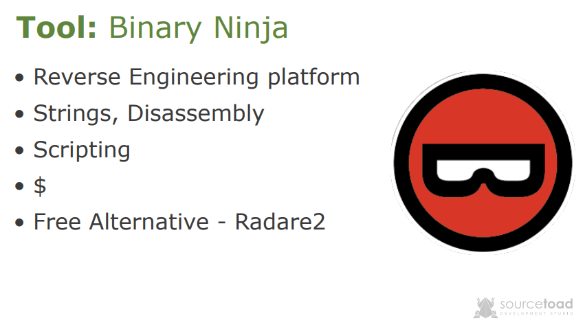
Putting images in a slideshow is a no-brainer, but you can seriously mess them up. So let's walk through my thinking when building this slide. I want to build a slide to talk about the tool: Binary Ninja. This is a paid reverse engineering tool much like IDA Pro, Ghidra or Radare2.
I could put a photo of the tool, like I'll attach below.
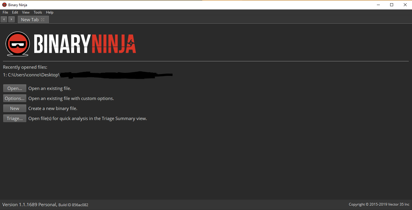
However, we are breaking our own points now. This view is full of tiny text, wasted space and required some elementary redacting of content. What is the audience going to care about what the program looks like?
Keeping with our points of large text. We can use the empty space to put the project logo. Now our slide looks organized and professional.
#4 - Background Changing

A neat trick I do is anytime I add an image that will be 100% of the page, I align the background to that image. This isn't always possible with gradients, but this is an Ubuntu terminal background.
So I put the image, center it and then change the background color to match. I have to do a few cleanup things for contrast (title color change) and add some arrows to point at the interesting area, but generally that takes a slide to the next level.
Side note - On the above slide I forgot to correct or remove the company watermark, which can be barely seen on the bottom right.
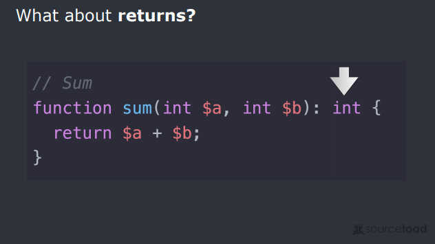
The above image I just messed up badly. The code snippet background I tried to match, but didn't. Probably was building this slide deck at night and flux kicked in messing with my perception of colors. I forgot to clean up the company watermark again - so this is just a bad slide.
#5 - Pixel Header Matching

This one is just a minor point, but I strive to align my header in the same position on every single slide. This means if you quickly go back n forth the screen isn't rewriting the header. This makes the transition seamless where the only thing changing is the body.
This becomes more important when talks are live-streamed and the video feed must update live with changes to your slide.
Conclusion
If you don't want the long iteration. I'll just list some points:
- Contrast is key. Dark on light backgrounds, or light on dark backgrounds.
- Font size large. It needs to be readable.
- Images need to be small, but viewable.
- Background colors aligned with 100% image slides.
- Aligned headers between slides.
- Small bullet points, no full sentences.
- Don't read your slides, use them as guides.
- Have a title slide with name of talk.
- Upload your slides when done to help others.
I hope that helps!
